View PDF
SNA 2.1
Getting Started with NodeXL, Layout, Visual Design, and Labeling
2.1.1 Introduction to NodeXL
Purpose: NodeXL is an open-source extension for Microsoft Excel designed to make Social Network Analysis (SNA) and visualization accessible to non-programmers.
Structure: It uses a structured workbook template with multiple worksheets:
Edges: Stores the “edge list” (pairs of connected vertices).
Vertices: Stores information about individual nodes (color, size, shape, etc.).
Clusters/Groups: Information about subsets of the network.
Scale: Typically supports networks of several thousand vertices (up to tens of thousands for some users).
2.1.2 Installation and Setup
Requirements: Windows Excel 2007 or 2010. (Not compatible with Mac Excel or older Windows versions).
Source: Downloadable from the Codeplex site (www.codeplex.com/NodeXL).
Opening: Access via the Start Menu or as an Excel Template (
NodeXLGraph.xlsx).
2.1.3 Basic Data Operations
Data Entry: You can manually type “Vertex 1” and “Vertex 2” names to create relationships.
Show Graph: Clicking “Show Graph” renders the data in the Graph Pane.
Highlighting: Clicking a row in the spreadsheet highlights the corresponding edge/vertex in the graph.
Importing: Data can be imported from:
Existing files (Pajek, UCINET, GraphML).
Social Media (Twitter, YouTube, Email collections).
Copy-pasting from other Excel sheets.
2.1.4 Layout (Arranging Vertices)
Automatic Layouts:
Fruchterman-Reingold: The default “force-directed” layout.
Circle: Arranges nodes in a circle; useful for reducing edge crossings in small networks.
Sugiyama / Harel-Koren: Other advanced algorithms for specific patterns.
Graph Types:
Undirected: Symmetric relationships (e.g., “Friends”).
Directed: Origin to destination (e.g., “Invitations”). Represented by arrows.
Manual Control:
Manual Layout: Dragging nodes with the mouse to emphasize specific structures.
Fixing/Locking: Vertices can be “Locked” via the Vertices worksheet (X and Y coordinates) to prevent them from moving during a refresh.
Navigation: Use the Zoom slider for detail and the Scale slider to adjust the size of all elements simultaneously.
2.1.5 Visual Design (Attributes)
Vertex Colors: Controlled by the “Color” column in the Vertices worksheet (uses standard CSS names like “Pink” or “Blue”).
Descriptive (Attribute) Data: Users can add custom columns (e.g., Age, Prior Party Attendance) to the right of the Vertices worksheet.
Autofill Columns: A powerful tool to map data to visual properties automatically.
- Example: Mapping “Number of Prior Parties” to “Vertex Size.”
Options Dialog: Allows setting the range (e.g., setting Min size to 2.1.5 and Max to 6.0) to prevent overlap or invisibility.
Legend: Automatically generated when using Autofill to help interpret the graph’s visual coding.
2.1.6 Labeling and Shapes
Vertex Labels:
2.1. Label as Shape: The text is the vertex; color and size apply to the text box.
Label alongside Shape: Text appears next to a shape (e.g., a Disk).
Tooltip: Text only appears when hovering over the node with a mouse.
Label Customization:
Label Fill Color: Sets the background of the text box.
Label Position: Can be set (Top, Bottom, etc.) to reduce clutter.
Images as Vertices: You can use image URLs or file paths in the “Image File” column to replace dots with profile pictures.
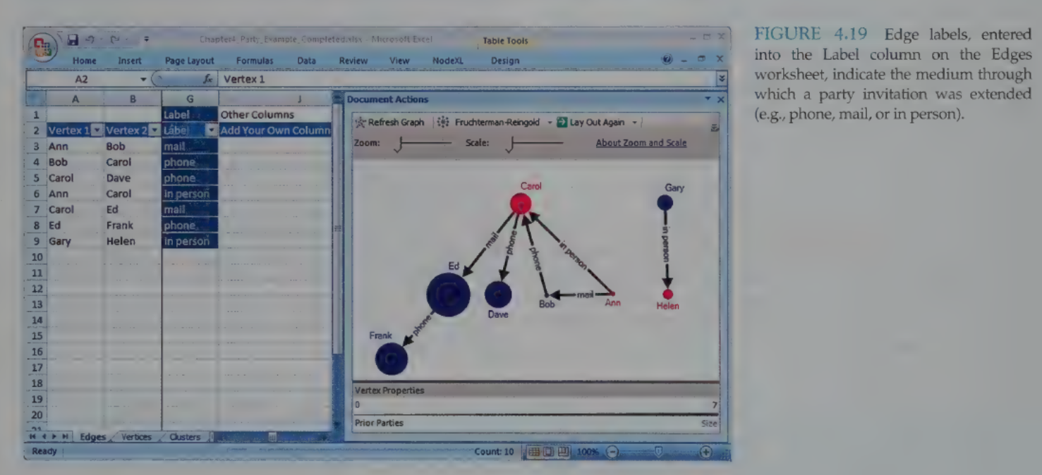
Edge Labels: Added via the “Label” column in the Edges worksheet to describe the relationship (e.g., “Phone call” vs. “Email”).
2.1.7 Practitioner’s Summary
NodeXL’s primary advantage is its integration with the spreadsheet paradigm, making it easy for business analysts to use familiar formulas and filtering while generating professional network visualizations.
The Autofill feature is the bridge between raw data and meaningful visual patterns.
2.1.8 Researcher’s Agenda
NetViz Nirvana: The research goal of reaching an ideal state where every node is visible, every degree is countable, and every edge can be followed.
Current Research Focus:
User performance on benchmark tasks (e.g., “How fast can a user find a cluster?”).
Automating layout while maintaining readability.
Developing task-specific aesthetics for directed vs. undirected graphs.
Link to original
SNA 2.2
Calculating and Visualizing Network Metrics
2.2.1 Introduction
Purpose: Network metrics (quantitative measures) complement visualization by helping analysts identify important vertices, subgroups, and the overall interconnectedness of a network.
Aggregate Metrics: Used to compare entire communities (e.g., density).
Individual Metrics: Used to identify specific actors’ roles, such as “popular” nodes or “bridge spanners.”
NodeXL Integration: Metrics calculated in NodeXL can be mapped to visual properties (size, color, etc.) or used for filtering.
2.2.2 - 2.2.3 Computing Graph Metrics (The Kite Network)
The Kite Network (by David Krackhardt) is a standard example used to demonstrate different centrality measures.
2.2.3.1 Vertex-Specific Metrics
Degree (Degree Centrality):
A count of unique edges connected to a vertex.
In-Degree (Directed only): Number of edges pointing to the vertex (e.g., being invited).
Out-Degree (Directed only): Number of edges pointing away from the vertex (e.g., inviting others).
Kite Example: Diane has the highest degree (6), making her the most “popular.”
Betweenness Centrality:
Measures how often a vertex lies on the shortest path (geodesic) between other vertices.
Identifies “gatekeepers” or “brokers.”
Kite Example: Heather has high betweenness because she is the only bridge between Ike/Jane and the rest of the group.
Closeness Centrality:
Measures the average shortest distance from a vertex to all others.
Note: In NodeXL v1.0.1.113, a lower score meant more central. In newer versions, the inverse is used (higher is better).
Kite Example: Fernando and Garth are best positioned to spread information quickly.
Eigenvector Centrality:
Calculates importance based on the importance of your neighbors. A link to a popular person is worth more than a link to a loner.
Kite Example: Ed has a higher score than Heather because Ed is connected to the highly popular Diane.
2.2. Clustering Coefficient:
Measures how connected a vertex’s neighbors are to each other.
A score of 1 means all your friends know each other (a clique).
2.2.3.3 Overall Graph Metrics (Summary Statistics)
Connected Components: Groups of vertices connected to each other but separate from the rest.
Diameter (Max Geodesic Distance): The longest “shortest path” between any two nodes in the network.
Graph Density: A ratio (0 to 1) of actual edges to the total possible edges. Higher density = more interconnected.
2.2.4 Les Misérables Case Study (Weighted Networks)
This network connects characters from the novel based on co-appearance in scenes.
2.2.4.1 Weighted Edges
Edge Weight: Represents the frequency of interaction (e.g., Valjean and Cosette appear in 31 scenes).
Visualization: Edge weights are typically mapped to Edge Width or Edge Opacity. Using a Logarithmic Mapping is often better than linear for data with high variance.
2.2.4.3 Identifying Key Roles
Jean Valjean: Highest Degree and Betweenness (the protagonist and main broker).
Gavroche: Highest Eigenvector Centrality (the “courier” linking many different character groups).
Myriel (The Priest): Low Degree but high Betweenness (he is the only link to several characters at the start of the book).
2.2.4.4 Metrics as Coordinates (Scatterplots)
NodeXL allows mapping metrics to X and Y coordinates rather than using a standard layout algorithm.
Example: Degree on the X-axis and Betweenness on the Y-axis.
Benefit: Makes outliers and “boundary spanners” (low degree but high betweenness) visually obvious.
Graph Elements: You can display Axes and a Legend via the NodeXL ribbon under “Graph Elements.”
2.2.5 - 2.2.6 Summary and Research
Practitioners: Combining quantitative metrics with visual attributes (like size/opacity) allows for a much deeper understanding of social roles than visualization alone.
Researchers: Focus is currently on Parallelization (speeding up calculations for massive networks) and developing better metrics for Bipartite (multimodal) graphs.
Study Tip: Remember that Betweenness is about control/brokering (Heather in the Kite), while Closeness is about speed/access (Fernando/Garth).
Link to original
SNA 2.3
Preparing Data and Filtering
2.3.1 Introduction
Challenge: Large networks are often too dense to visualize clearly.
Core Strategies:
Summarization: Rolling up relationship data into a weighted form (e.g., merging duplicate interactions).
Filtering: Removing selected vertices or edges to identify extreme values or specific subsets.
Goal: Create understandable visualizations by reducing edge crossings and vertex overlaps.
2.3.2 Serious Eats Network Example
The Serious Eats Network is based on community members (people) posting to blogs and discussion forums.
2.3.2.1 Multimodal Network Data
Multimodal (Bimodal/Two-Mode): A network with different types of vertices (e.g., people and the blogs/forums they post to).
Affiliation Networks: A specific type of bimodal network connecting people with events or organizations they are affiliated with.
2.3.2.2 Merging Duplicate Edges
Process: NodeXL’s “Merge Duplicate Edges” feature condenses multiple identical rows into one.
Result: A new Edge Weight column is created, indicating how many times that specific connection occurred. No data is lost; the weights simply summarize the frequency.
2.3.2.3 - 2.3.2.6 Visualizing Multimodal Data
Sorting: Alphabetical sorting (A to Z) helps group vertices of the same type (e.g., those starting with “B_” for blog or “F_” for forum).
Visual Coding:
People: Black disks.
Blogs: Blue solid diamonds.
Forums: Orange solid squares.
Layout Management: The “Put smaller components at the bottom” option helps separate isolated groups from the “Giant Component.”
2.3.3 Filtering Strategies
Filtering reduces clutter to reveal hidden structures or important features.
Types of Filtering:
Value-based: Removes items above or below a numerical value (e.g., age, degree, or edge weight).
Categorical: Retains or removes items based on a category (e.g., region or gender).
Ordinal: Filters by rank (e.g., showing only the “Top 10” most connected users).
2.3.3.1 Dynamic Filters
Function: Real-time sliders that hide/show data in the graph pane without deleting it from the workbook.
Frequency Distributions: Histograms above sliders show the concentration of data at different values.
Filter Opacity: Allows “filtered out” items to remain visible as faint “ghost” images (e.g., setting opacity to 10%).
2.3.3.2 Filtering via Visibility Column
Method: Using the Autofill Columns feature to populate the “Visibility” column.
Difference from Dynamic Filtering: Items marked as “Skip” in the visibility column are not read into the graph at all. This allows layout algorithms to treat the remaining nodes as the entire network.
2.3.3.3 Subgraph Images
Egocentric Networks: Visualizing the “local neighborhood” of a single vertex.
Levels of Adjacency: * 1.0: The vertex and its neighbors.
1.5: The vertex, its neighbors, and connections between those neighbors.
2.0: Includes “friends of friends” (FOAF).
Purpose: Helps identify social roles (e.g., distinguishing between a user who posts in isolated topics vs. a “hub” user).
2.3.4 - 2.3.6 Summary and Research
Practitioner Perspective: Filtering is an iterative process. Analysts use dynamic filters to find a threshold and then hard-filter (using Visibility) to create a clean, persuasive final image.
Researcher Perspective: Future goals include Process Models—standardized sequences of actions (filtering, layout, and metrics) that ensure a complete and systematic exploration of social media data.
Study Tip: Remember the difference between Hidden/Hide (Dynamic Filters) and Skip (Visibility Column). Skipping removes the data from metric calculations and layout processing; Hiding just makes it invisible.
Link to original
SNA 2.4
Clustering and Grouping
2.4.1 Introduction to Clusters
Definition: Clusters (also called communities or groups) are pockets of densely connected vertices that are only sparsely connected to other pockets.
Strategic Value: Identifying groups helps in recognizing competing or complementary coalitions, potential allies, and key individuals who bridge different groups.
Groups vs. Hierarchies: Networks reveal authentic groups based on actual ties (e.g., communication patterns) rather than formal memberships or “org-charts.”
2.4.2 The 2007 Senate Voting Analysis
This case study examines the voting patterns of U.S. Senators to identify political coalitions based on “Percent Agreement” (how often two senators vote the same way).
2.4.2.1 Filtering for Structure
Problem: In a weighted network where everyone has at least some connection, the initial visualization is often a “dark mass” of lines.
Solution: Filter edges by a threshold (e.g., showing only ties with >65% agreement).
Outcome: This “skips” weak ties, allowing the layout algorithm to visually separate the senators into distinct groups (Democrats vs. Republicans).
2.4.2.2 Automatic Clustering in NodeXL
Algorithm: NodeXL uses a dynamic algorithm (Wakita & Tsurumi) that finds groups without needing a predetermined number of clusters.
Logic: It maximizes “modularity”—looking for dense internal connections vs. sparse external ones.
Worksheets:
Clusters: Lists the identified groups (C1, C2, etc.) and assigns default colors/shapes.
Cluster Vertices: Maps each individual node to exactly one cluster.
Limitation: Algorithms lack cultural context (e.g., they might assign “Red” to Democrats), requiring manual color correction by the analyst.
2.4.2.3 Manual Grouping
Analysts can override algorithms by pasting known affiliations (e.g., official Party labels) into the Cluster Vertices worksheet.
Visual Insight: Manual grouping in the 2007 Senate data revealed that Independent senators (Lieberman, Sanders) clustered with Democrats, and identified specific “boundary spanners” (Snowe, Collins, Specter) who sat between the two parties.
2.4.3 Les Misérables Character Clusters
Applying automatic clustering to the Les Misérables co-appearance network groups characters like the “student revolutionaries” together.
Insight: Even if vertices aren’t adjacent in a specific layout, being in the same cluster color suggests shared ties (e.g., Javert and Fantine grouped together due to mutual connections to Valjean).
2.4.4 Case Study: FCC Lobbying Coalitions
This complex network analyzed joint filings by organizations to the FCC.
Vertices: Organizations.
Edges: Joint filings (thickness = frequency).
Metrics Used:
Vertex Size: Total filings (investment proxy).
Vertex Color: Eigenvector Centrality (influence/strategic position).
Analysis: The layout used the Fruchterman-Reingold algorithm followed by the Find Clusters feature to identify real-world coalitions (e.g., rural telephone companies vs. competitive local carriers).
2.4.5 Practitioner’s Summary
Iterative Process: Finding groups often requires a “filter layout cluster” workflow.
Layout vs. Cluster: While layout algorithms (like Fruchterman-Reingold) visually group nodes, the Clustering feature mathematically defines them, allowing for specific color/shape coding that persists even if the layout changes.
2.4.6 Researcher’s Agenda
Speed: Current clustering algorithms are computationally expensive; research is focused on parallelization for “mega-scale” networks.
Attribute vs. Topology: Researchers are exploring “semantic substrates”—clustering nodes by their attributes (e.g., university attended) rather than just their connections.
Overlapping Communities: Developing models where a vertex can belong to more than one group (e.g., a person who is part of both a “family” cluster and a “work” cluster).
Technical Sidebar: Fruchterman-Reingold Layout
Link to original
Force-Directed: Treats edges like springs and vertices like repelling magnets.
Advanced Settings:
Repulsive Force: Increase this to spread out “hairballs” and reduce vertex overlap.
Iterations: The number of times the “springs” are allowed to move. High-complexity networks require more iterations to reach a stable state.